Sorrel — café and hospitality website concept
An original SR7 Web Design portfolio concept: a premium café-bistro website for Amble Harbour, built as hand-written static HTML with a bottle-green and parchment design system.
Sorrel Café & Bakehouse is an original SR7 Web Design portfolio concept. It is not a trading business and was not commissioned by a client — it exists to show how we would build a website for an independent café, from the design system down to the live server configuration. The finished site runs on its own domain at sorrel.cafe.
The objective
Design a café website that reads as a genuine independent business rather than a template: warm, composed and premium, with breakfast, pastries and coffee as the commercial centre. A visitor arriving on a phone should be able to reach the menu, the opening hours and the location within seconds, and the page should still feel designed rather than merely functional.
The concept is sited near Amble Harbour in Northumberland. Every factual detail that could not be honestly invented — an exact street address, a telephone number, reviews, awards, trading history or a hygiene rating — was deliberately left out rather than fabricated.
Creative direction
The palette is the identity. A deep bottle green carries the navigation, the menu panel and the footer — the large feature surfaces — against a warm parchment ground. Oxblood is rationed to roughly five per cent of any screen: the primary button, one italic accent word, the menu row hover and the closed-now state. Antique brass does the fine rules and small details, and a soft cream carries reversed text and menu prices.
- Warm parchment
#F2E9DC— page ground - Deep bottle green
#24382F— feature panels and navigation - Oxblood
#743339— selected actions and menu highlights - Espresso
#241E1A— body text - Antique brass
#B08A55— hairlines and detail - Soft cream
#FFF9EF— cards, reversed text and prices
Typography is a single editorial serif, Baskervville, in one weight plus its italic, set over Work Sans for menus, prices and practical information. Hierarchy comes from size rather than weight, and the italic cut is the only emphasis in the system. Both faces are self-hosted, so the page renders without waiting on a third-party font request.
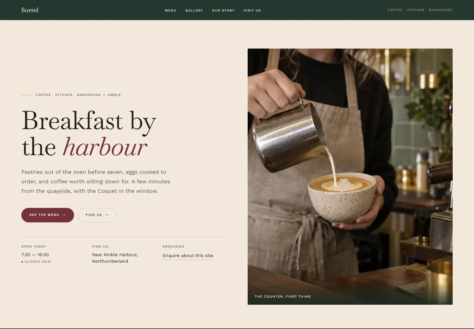
The menu
The menu is the commercial heart of the site, so it is presented as accessible HTML rather than a PDF or an image: breakfasts, breakfast sandwiches, lighter dishes, pastries and bakes, cakes, speciality coffee, tea and cold drinks. Prices are set in tabular figures so a column lines up on the decimal, vegetarian, vegan and gluten markers sit inline, and the allergen note promises nothing it cannot keep. Every item and price is editable in place without disturbing the design system.
On a phone
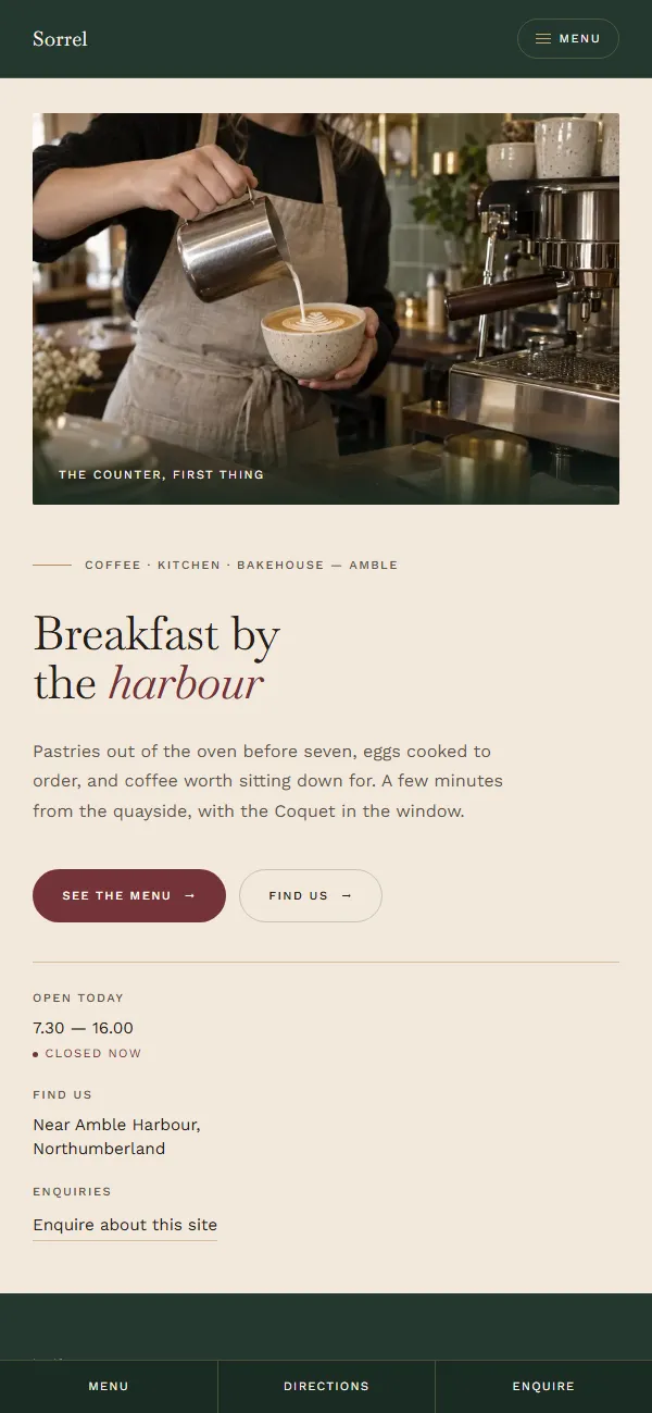
The layout was designed and tested at 390, 430, 768, 1024 and 1440 pixels. On narrow screens the photograph moves above the copy, the fact ledger stacks, the navigation collapses into a full-screen drawer, and a sticky bar keeps Menu, Directions and Enquire permanently within reach.
Accessibility
Colour was chosen and then measured, not assumed. Body text on the parchment ground reaches 13.7:1 and reversed text on bottle green 11.9:1 — both comfortably AAA. One early decision had to be reversed: antique brass fails at 2.6:1 as text on parchment, so it was withdrawn from type entirely and now carries only hairlines, with a darker cut used wherever a brass tone has to be readable.
- Keyboard reachable throughout, with a skip link and a visible focus ring
- The gallery lightbox traps focus, closes on Escape and returns focus to the thumbnail
- The mobile drawer is unfocusable while closed
- Every interactive target is at least 24 pixels
- Motion honours
prefers-reduced-motion
Gallery and enquiries
The gallery opens into a lightbox with keyboard navigation, an image counter and captions drawn from the alt text. The enquiry form validates properly and is honest about where a message goes: because Sorrel is a concept rather than a café, the form states plainly that it reaches SR7 Web Design, and its completion message says so again rather than pretending an order has been placed.
Found in search
The site is fully indexable and identifies itself consistently as Sorrel Café & Bakehouse near Amble Harbour, Northumberland — the full entity name rather than the bare word “Sorrel”, which competes with the herb. Valid CafeOrCoffeeShop structured data carries only honest information: locality, opening hours and menu sections, with no street address, telephone number or review data invented to fill a field.
- Canonical
https://sorrel.cafe/, with HTTP and www redirected to it - Open Graph and Twitter card data with a generated 1200×630 image
- Production
robots.txtand XML sitemap - Internal design documentation excluded from the public site entirely
Performance
Measured with Lighthouse against the live production site, not a local build:
| Performance | Accessibility | Best practices | SEO | |
|---|---|---|---|---|
| Desktop | 100 | 100 | 100 | 100 |
| Mobile | 98 | 100 | 100 | 100 |
Photography was converted from PNG to WebP — 19 MB down to 1.4 MB — and served responsively, so a phone never downloads a 1600 pixel image to fill a 390 pixel column. Cumulative Layout Shift is zero on both desktop and mobile.
Built without a framework
The whole site is hand-written HTML, CSS and vanilla JavaScript: no framework, no build step and no dependencies. It is a single page with anchor navigation, which suits the amount of content a café actually has, and it can be edited by opening one file.
See it live
Get a quote
Tell me what you do and what you need. I'll come back to you with a straight answer and a price.
- Phone07538 227194
- Emailinfo@sr7webdesign.co.uk