Gentry House Barbers — website concept
An SR7 concept project: a complete premium barbershop website, built to show what a barbershop site can be when branding, imagery, motion and development are treated as one piece of work.
An SR7 concept project, not a client commission. Gentry House Barbers is a fictional barbershop in Newcastle, designed and built by SR7 Web Design to show what a premium barbershop website can be.
View the live website → (opens in a new tab)
The brief
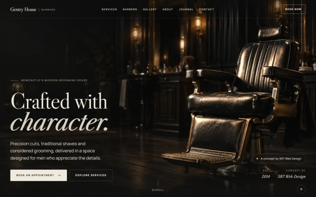
Most barbershop websites are a booking widget with a logo on top: a stock photo of clippers, a price list and a phone number. The idea here was a barbershop that feels like a proper grooming house before you’ve even booked: low light, leather, brass, and time taken over the details.
It had to set out the services and prices clearly, introduce the barbers, give people a reason to come back through a journal, and let a visitor go all the way through booking an appointment. And because Gentry House isn’t real, it had to say so plainly without spoiling the experience.
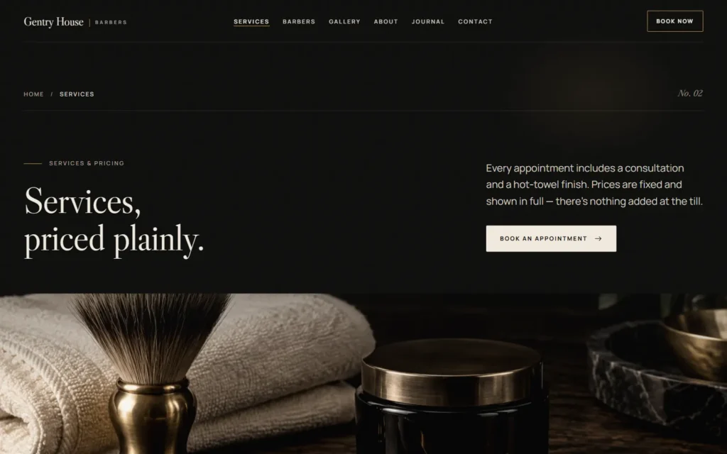
- Home, services and pricing, barbers with their own profiles, gallery, about, journal and contact
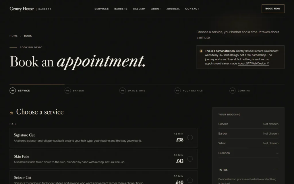
- A five-step booking journey: service, barber, date and time, details, confirm
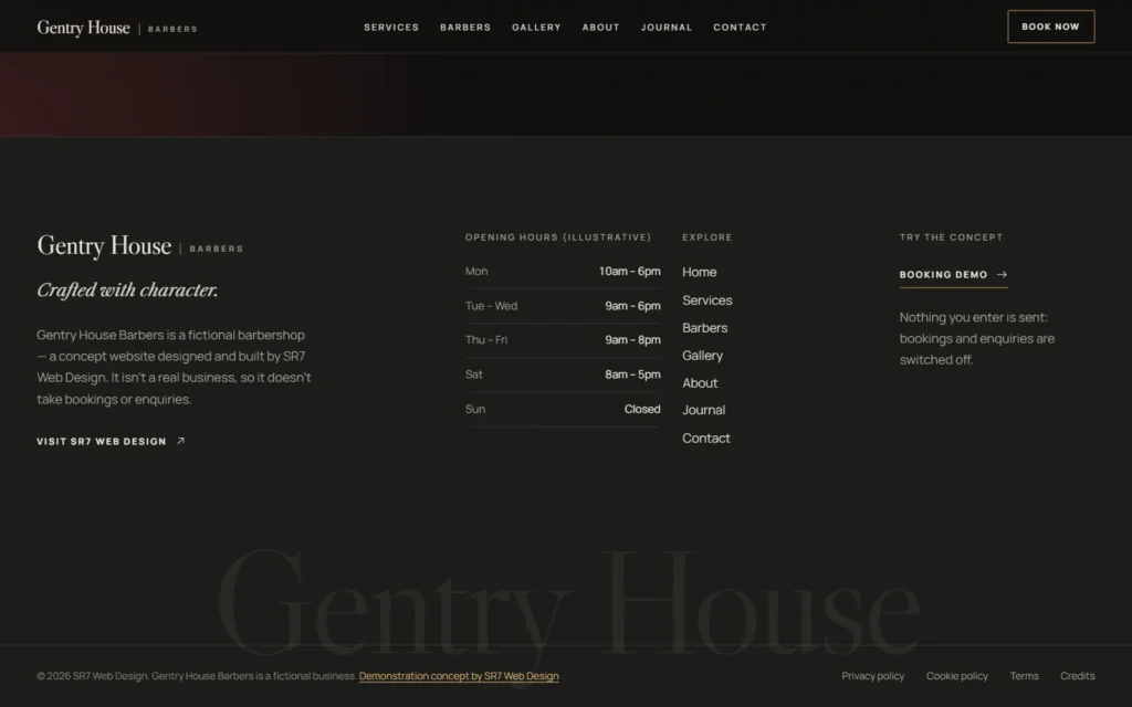
- Opening hours set once and used in the header, footer and booking availability
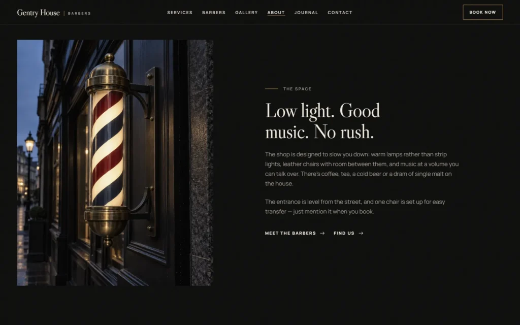
- The traditional red, white and blue barber pole, kept as part of the identity
- Privacy, cookie and terms pages written for a concept site
Design direction
The look started in the GetLayers design library rather than on a blank page. I chose one style, Obsidian Luxe (near-black grounds, warm brass and a high-contrast serif), and held every page to it, so nothing drifts.
Each section was then laid out from GetLayers compositions instead of the usual centred stack of heading, text and button. Halcyon, Altitude, Artist, Negantropy, Lumora, Marcus Vane and Vesper were the references. That is where the editorial rhythm comes from: large headlines, asymmetric columns, numbered sections and plenty of space.
- Libre Caslon Display for headlines, Libre Caslon Text for italics, Manrope for everything else
- One palette: deep blacks, bone white and brass
- A bespoke set of thirteen generated images, with one directional light, warm skin tones and texture, and no stock photography
- The barber pole given pride of place in About, under The space
The cinematic chair hero
The homepage opens on a single shot: an empty leather barber’s chair in a low-lit room, with the light moving slowly across it. It feels like film, but nothing 3D runs in your browser.
The shot was made offline. I painted a depth map for an approved still of the chair, drove a slow camera move through it with a WebGL shader in headless Chrome, and encoded the result with ffmpeg as a ten-second seamless loop. The website itself only ever loads an ordinary video file.
- WebM (VP9) at about 1.0 MB, with an H.264 MP4 at about 1.6 MB as the fallback: muted, looping, no audio track
- The poster is the film’s exact first frame, so the switch from still to video can’t be seen
- The film loads only after the page has loaded, on screens at least 768 × 600, and never with reduced motion, Data Saver or a 2G connection
- Phones get a square still of the same scene instead of the video
- A pause button in the corner, remembered on the device
- The headline and buttons never wait for the film
A responsive build
Gentry House is built by hand in Next.js 16 with TypeScript and CSS Modules: no page builder, no UI kit and no animation library. Motion is CSS with one shared IntersectionObserver. The whole site is exported as static HTML, so the host serves it directly with nothing to run on the server.
The phone layout was designed rather than left to squash. The menu becomes a full panel, the booking steps stack into a single column, and the hero swaps the film for a still cropped for a phone screen.
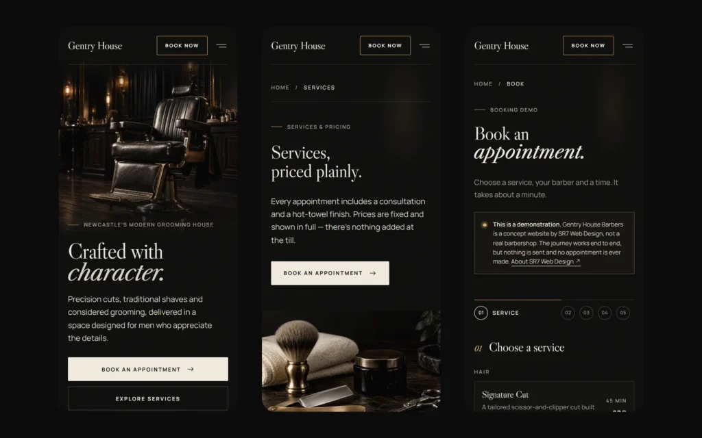
- A five-step booking demo with a running summary, on every screen size
- 19 prerendered pages with clean URLs and one canonical address
- Every photograph served from the site itself as responsive AVIF and WebP, with no client-side JavaScript
- A custom 404 page, a sitemap, a web manifest and social sharing images
Accessibility
Accessibility was part of the build rather than a check at the end.
- A skip link, visible focus styles and a logical heading order on every page
- A pause control for the hero film, and reduced-motion support throughout
- Descriptive alt text, and links that open a new tab say so to screen readers
- The switched-off enquiry form explains why, rather than failing silently
- Lighthouse Accessibility: 100 on every page tested
Performance
A cinematic homepage is usually a slow one. Here the film is progressive enhancement: the page is complete and usable before the video even starts to download.
- CSS is inlined into each page and split by route, so a page carries only the styles it uses
- Sections off the screen skip rendering until they come close to the viewport
- Hashed files are cached for a year, pages are rechecked on every visit, and everything text-based is Brotli-compressed
- Lighthouse on the live site, 12 September 2026: homepage Performance 94 to 95 on mobile and 98 on desktop, with Accessibility, Best Practices and SEO at 100 on every page tested
Honest by design
Gentry House had to feel real right up to the point where someone might mistake it for a real business. So the site says what it is on every page, without shouting.
- A small “A concept by SR7 Web Design” note in the hero, and bookings and enquiries switched off
- “Demonstration concept by SR7 Web Design” in every footer, on the About page and on each legal page
- The booking demo finishes with “Nothing has been booked” and sends nothing anywhere
- The enquiry form is switched off, with a note explaining why
- No phone number, street address or social accounts, and the search markup describes a website concept, not a business
The result
Gentry House Barbers is an SR7 concept project, built to show what a barbershop website can become when the branding, the imagery, the motion and the build are treated as one job.
There are no bookings or reviews to show here, because it isn’t a real barbershop. What there is, is the site itself, live and working. Open it on your phone.
View the live website → (opens in a new tab)
More work
- Ember & Bone — a premium steakhouse concept built around fire, film and editorial type
- KPM First Aid Training — a client rebuild with a custom plugin behind it
- Treemasters — a trade site built to get the phone ringing
- Back to all work
Want a site that looks the part?
Barbers, salons, restaurants, hotels — any business where the website has to match the experience in the chair. If that’s you, this is the level of design I can build for you. Get a quote or call 07538 227 194.
Get a quote
Tell me what you do and what you need. I'll come back to you with a straight answer and a price.
- Phone07538 227194
- Emailinfo@sr7webdesign.co.uk